The Art Of The South.
Brand identity | digital | Print


The Mission
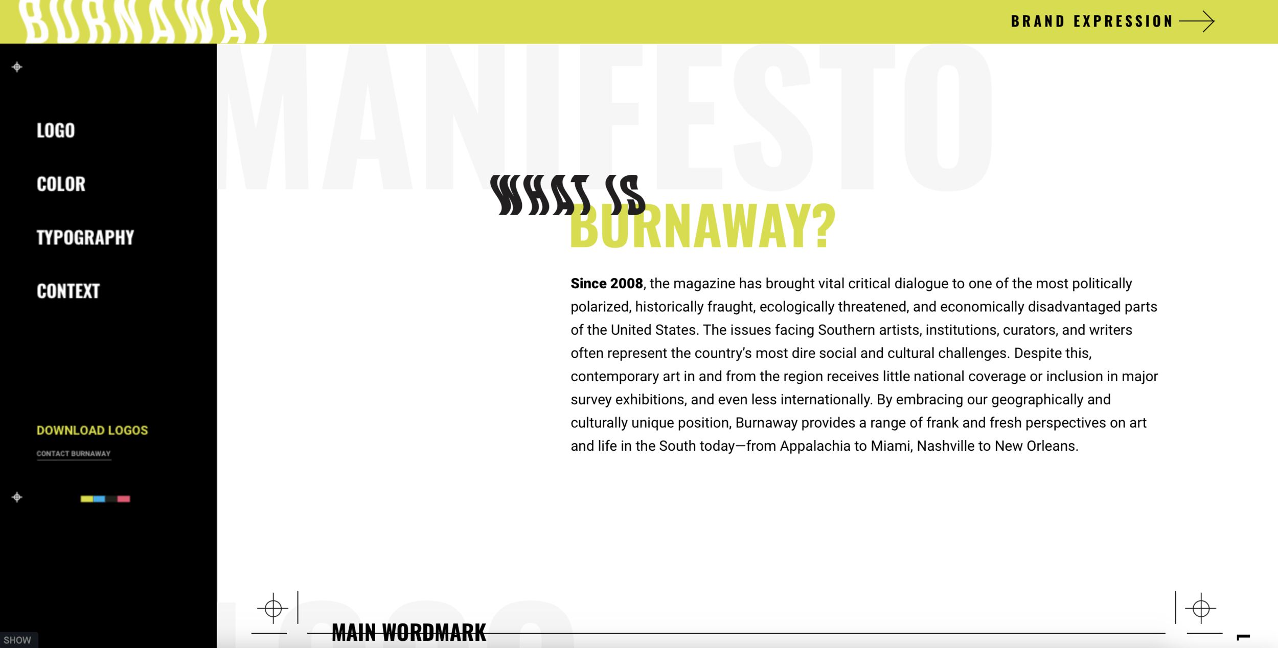
Burnaway is a contemporary art publication that, since 2008, has brought vital critical dialogue to one of the most politically polarized, historically fraught, ecologically threatened, and economically disadvantaged parts of the United States–The South. They solely focus on Southern artists, institutions, curators, and writers who have garnered little national coverage or inclusion in major survey exhibitions, and even less internationally. There is a stigma to art from the south, which Burnaway is fighting hard to overcome.
Burnaway asked us to help them overcome both an in-market position that felt grassroots or blog-like and not like a serious art publication, and also create a flexible visual language for the brand that could be translated to print, online publication, and social and event based marketing.


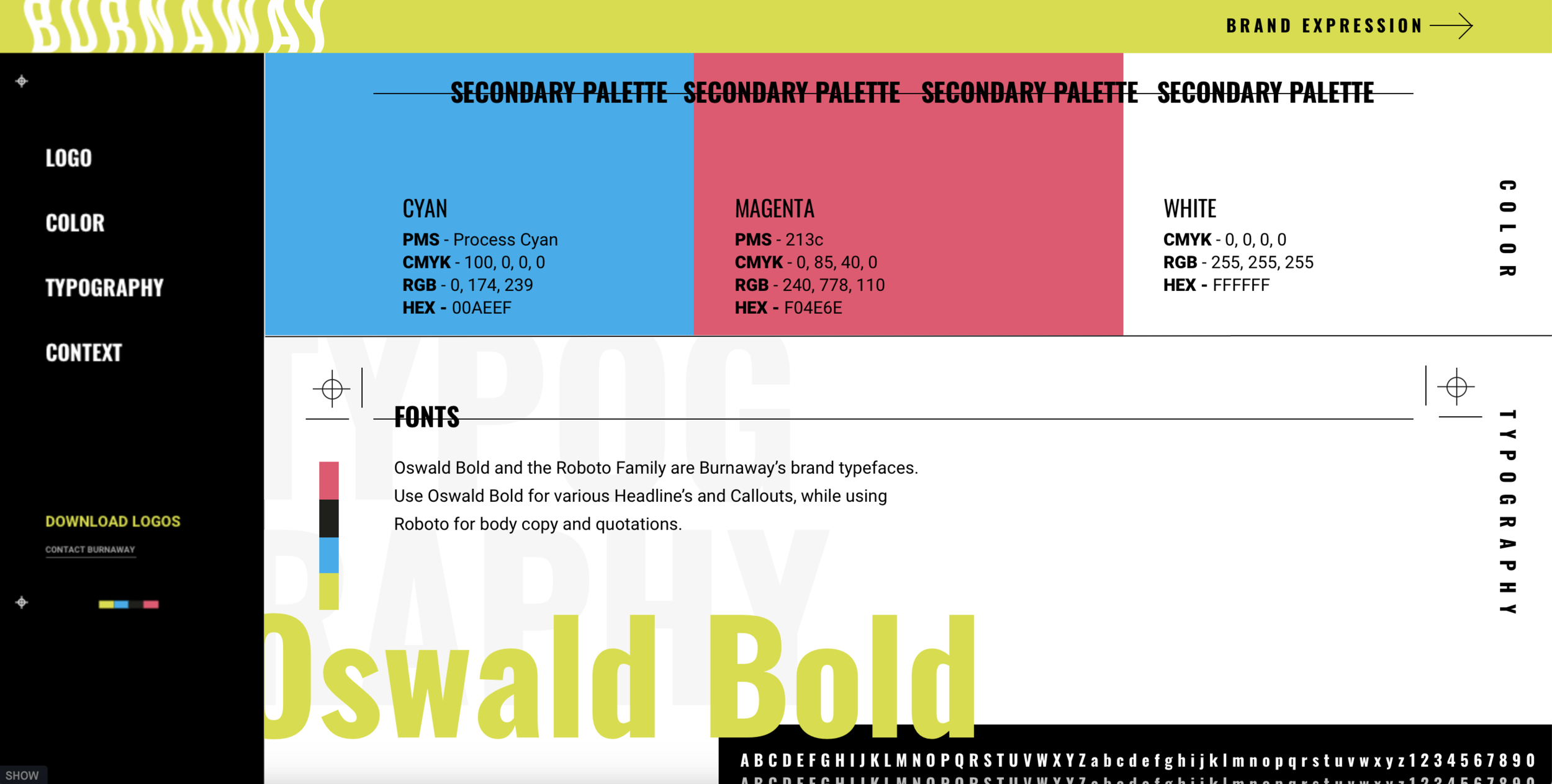
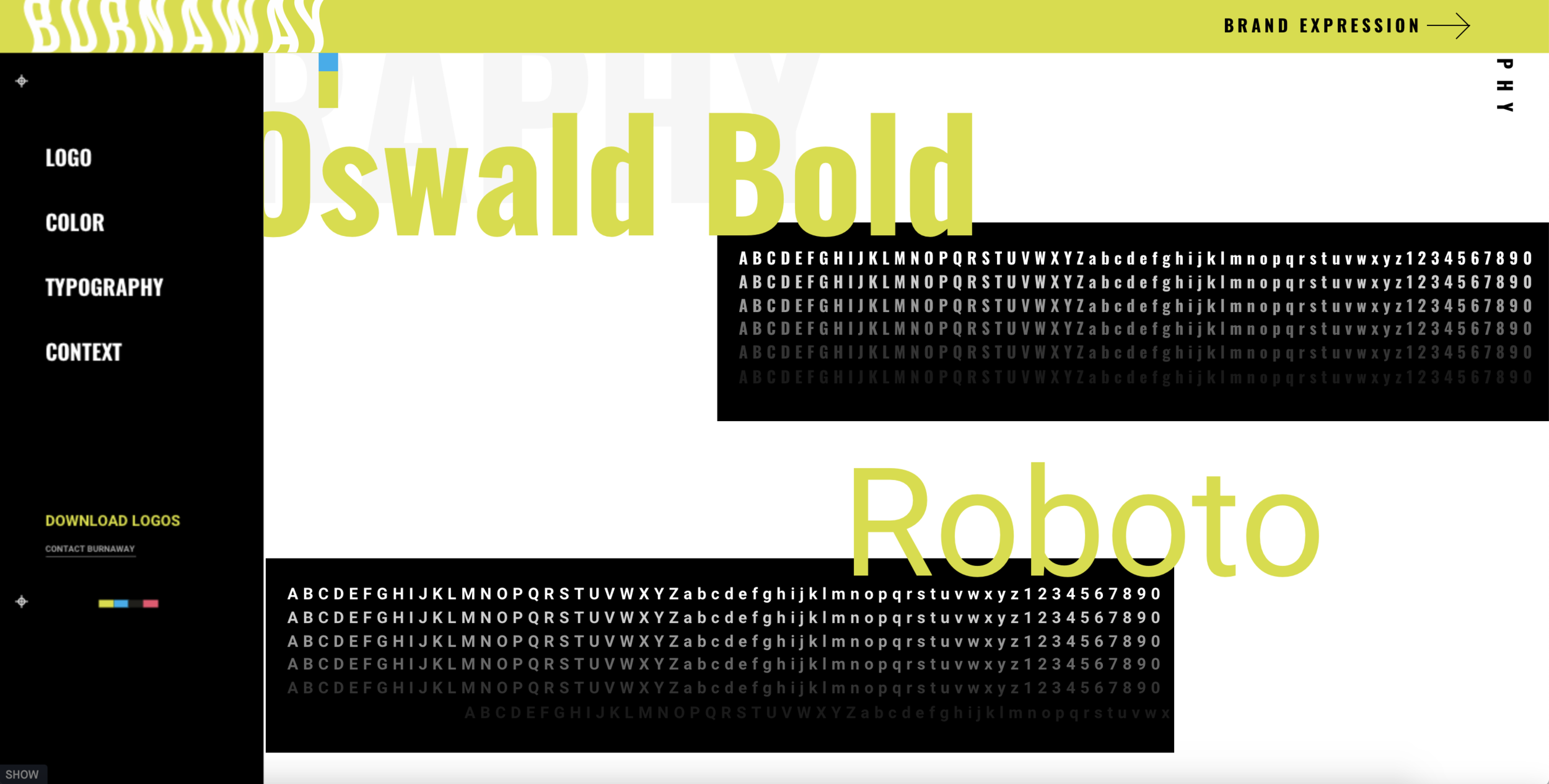
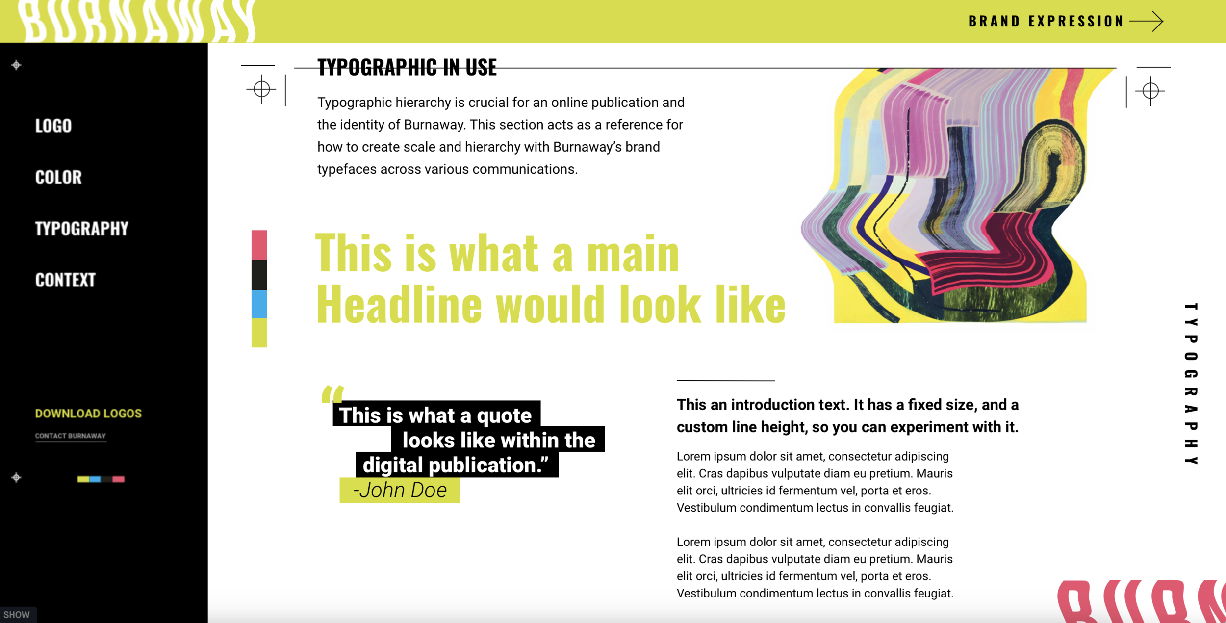
A completely fluid identity system
We knew that in order to stand out and adapt to a variety of styles and media, the new Burnaway identity needed to be fluid and flexible. The traditional approach to one static logo and identity wouldn’t work to achieve this goal. To reach an incredibly diverse audience, in a large geographic region, the new Burnaway identity had be completely fluid. It was also vital to establish a brand that felt at home in the context of contemporary art. It needed to be progressive. It hit us early in the process that with a contemporary art publication as a client, the pressure was on. We loved that.

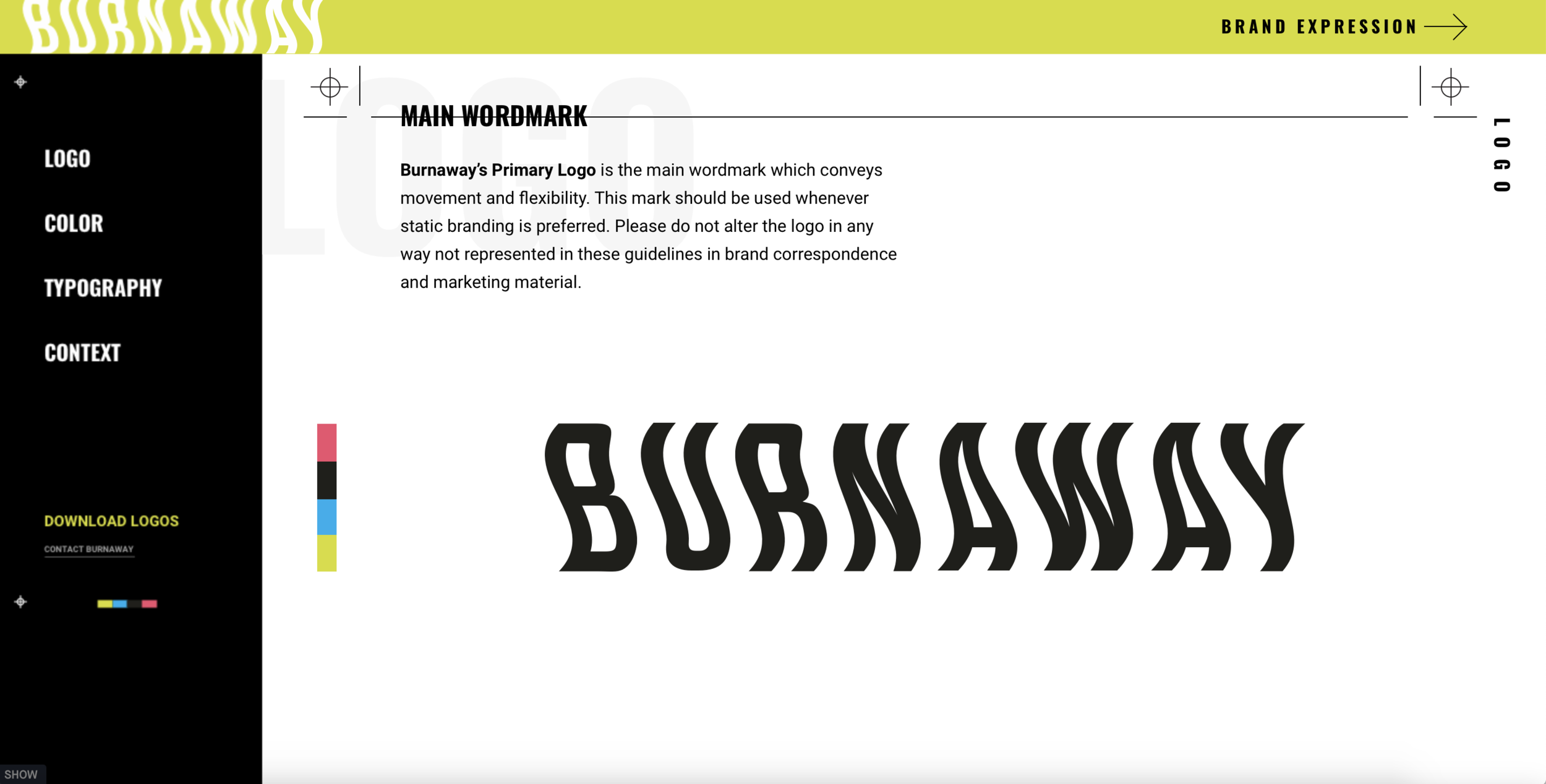
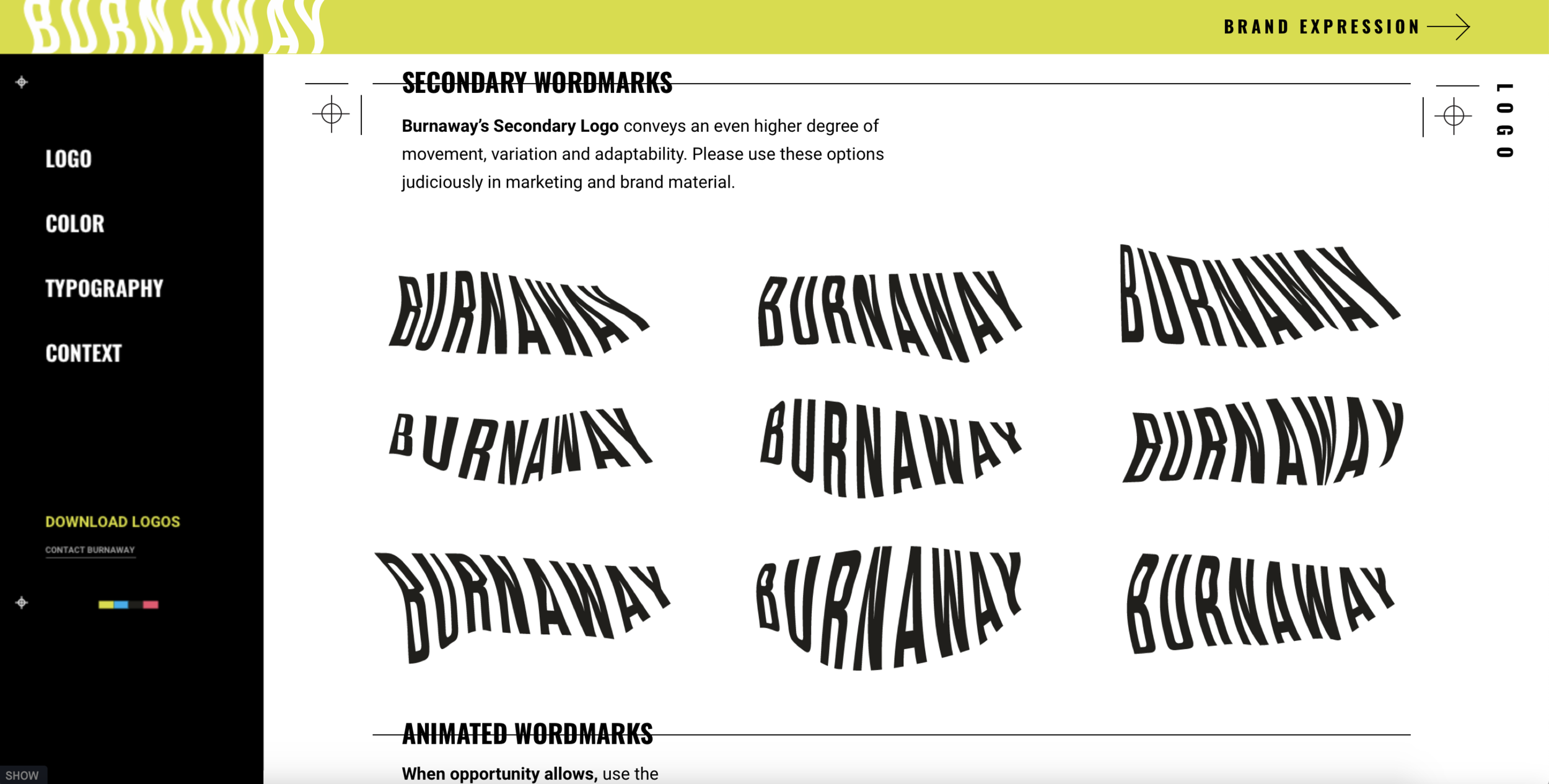
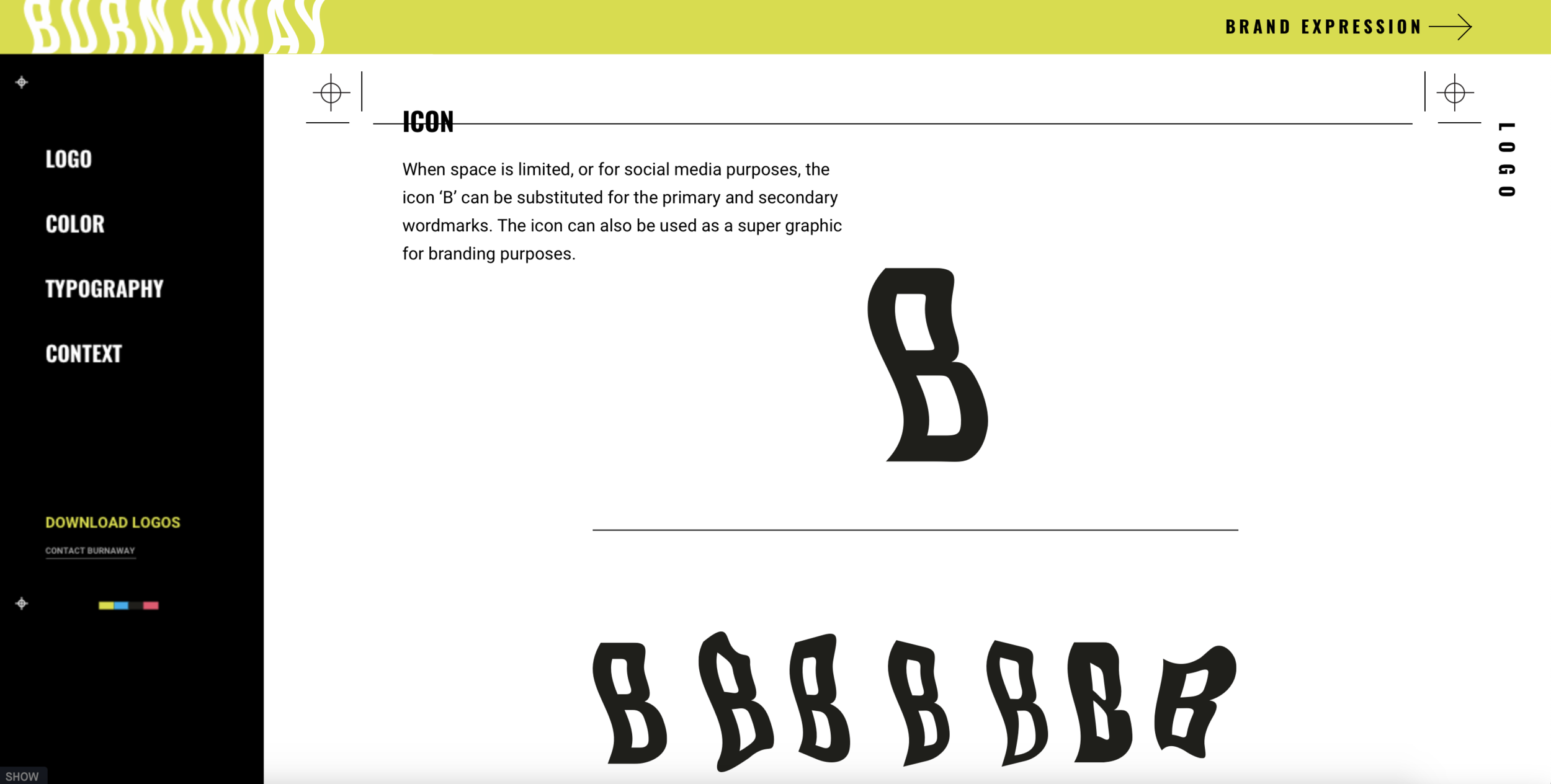
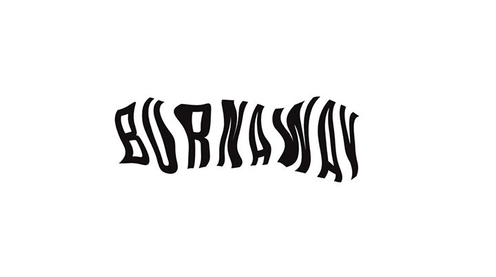
Being based in Atlanta, aka “hotlanta” and of course with the name “Burnaway”, we concentrated visually on the theme of heat. Somewhat obvious, sure, but we didn’t want to ignore that clear tie. Like a flame, we wanted to create a constant sense of motion of abstract form. Creating a series of custom letter forms, each iteration of the Burnaway logo is slightly different. With no single expression of the logo mark, any of the various iterations can be used interchangeably creating a contemporary piece of art in the process. To this extent, our design solution is quite unique.
This new identity encourages the artwork on display to be incorporated into the brand identity, thus creating new artwork as a result. The identity included visual executions for print-based marketing, a new website design, templates for social media, and a variety of physical elements featuring the new branding.